 EN
EN LT
LT DE
DE PL
PL DA
DA SV
SV NB
NB FI
FI IS
IS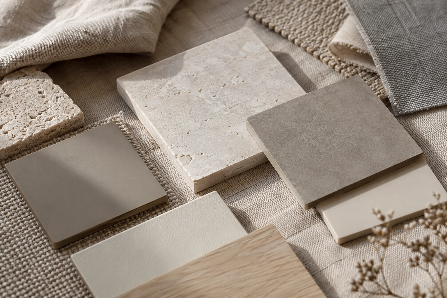
Matte and gloss finishes can make the same shape appear noticeably different. Edges, reflections and handling marks become more or less visible according to the surface. When comparing finishes, separate appearance from performance. A label describing sheen does not identify the coating system, establish scratch resistance or tell you which cleaning method is suitable.
See what the finish does to the form
A matte surface generally produces fewer pronounced directional reflections than a glossy one. In a photograph this can make the form look more even. A gloss finish makes surrounding light sources visible on the body: a window, a lamp or the outline of pale furniture may appear as a strong reflected shape.
Texture introduces another variable. Fine relief becomes more evident when light crosses it from the side, and less evident when the object is viewed from farther away. A close-up photograph can make a subtle finish look much more pronounced than it will on a shelf. Review a full-object image as well as the detail photograph.
Compare under similar lighting
One finish photographed in a studio and another photographed beside a window are not a controlled comparison. Differences may come from lighting rather than the coating. Request front and side views made in the same conditions. Seeing the vessel turned slightly helps explain how a highlight moves across its surface.
A dark matte finish can appear lighter in a bright photograph, while warm room lighting adds a brown cast to a neutral surface. This does not automatically indicate the wrong colour. Where a close interior match matters, a physical finish sample is more informative than comparing photographs on several unrelated screens. Keep the sample in the intended room before making the final decision.
Consider touch and cleaning
Dust, fingerprints and cleaning marks show differently on different finishes. It would be inaccurate to assume that every matte coating is easy to clean or that all glossy surfaces resist scratching. Performance depends on the specific surface treatment and its use conditions, not just on its visual category. Read the care instructions for the actual variant.
Check whether the maker specifies a dry or lightly damp cloth and whether particular cleaners are excluded. Do not polish a matte area in an attempt to remove a local mark: the treatment may change the sheen of that spot. If a finish is damaged, ask about the coating before attempting a household repair that could create a second visible difference.
Check lettering on the chosen finish
Personalisation depends on contrast between the lettering and the surface. The same typeface does not look identical on a dark, pale, smooth or textured background. An approval proof should identify the finish as well as the text position. A generic vessel image is insufficient when the inscription must remain legible from its normal viewing distance.
Connect the decision to the actual location. Fine relief may be less evident on a high shelf, while a strong reflection can become more conspicuous near a window. The finish should suit the room and the way the urn will be handled. It need not dominate the surrounding objects to remain visible and distinctive.
Read about body materials and coatings in the materials section and consult the personalisation guide before approving an inscription.